KKR Pro Ex

Categories

Categories

Web

Web

Industry

Industry

Consulting

Client

Client

KKR Process Excellence

KKR Process Excellence is a B2B sales consultancy – process design, coaching, AI-driven tools. Their audience is older decision-makers in leadership positions, the kind of people who book consultancies based on whether the pitch lands in the first ten seconds. Before this project they had no web presence. The site had to carry the same weight as a room full of existing relationships.

The brief was to stand out without looking unfamiliar. B2B consultancy websites have a visual formula – white backgrounds, blue accents, stock handshakes, a lot of empty space reading as "premium." Copy it and you blend in. Break it too hard and you lose trust with the exact people you're trying to reach.

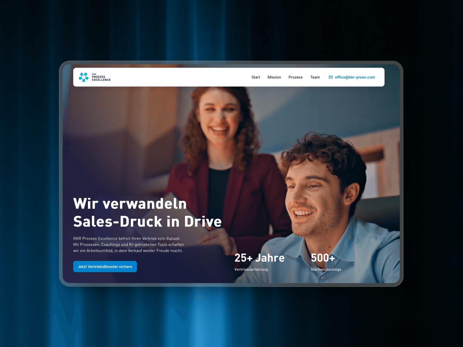
The answer was a dark, cinematic frame around copy that refuses to waste a second. The headline – Wir verwandeln Sales-Druck in Drive – came from the copywriter at our partner agency, and it sets the tone: direct, punchy, no jargon. The cinematic hero replaces the usual stock handshake. Stats (25+ years, 500+ coachings) sit where they can be scanned instantly. The nav has four items plus the email address in the header, usable immediately instead of buried on a contact page.

The whole architecture is built around one assumption: the person reading this is busy, skeptical, and making a fast judgment about whether these people know what they're doing. So the site says what it is, shows who's behind it, lays out the four-step process, and gets out of the way.

AI is part of what KKR offers, so it's mentioned where it belongs – but the site doesn't lean on it as the hook. Sales leaders don't buy AI, they buy outcomes. Less friction. More drive. That's what the copy commits to, and the design stays out of its way.

KKR Pro Ex

Categories

Categories

Web

Web

Industry

Industry

Consulting

Client

Client

KKR Process Excellence

KKR Process Excellence is a B2B sales consultancy – process design, coaching, AI-driven tools. Their audience is older decision-makers in leadership positions, the kind of people who book consultancies based on whether the pitch lands in the first ten seconds. Before this project they had no web presence. The site had to carry the same weight as a room full of existing relationships.

The brief was to stand out without looking unfamiliar. B2B consultancy websites have a visual formula – white backgrounds, blue accents, stock handshakes, a lot of empty space reading as "premium." Copy it and you blend in. Break it too hard and you lose trust with the exact people you're trying to reach.

The answer was a dark, cinematic frame around copy that refuses to waste a second. The headline – Wir verwandeln Sales-Druck in Drive – came from the copywriter at our partner agency, and it sets the tone: direct, punchy, no jargon. The cinematic hero replaces the usual stock handshake. Stats (25+ years, 500+ coachings) sit where they can be scanned instantly. The nav has four items plus the email address in the header, usable immediately instead of buried on a contact page.

The whole architecture is built around one assumption: the person reading this is busy, skeptical, and making a fast judgment about whether these people know what they're doing. So the site says what it is, shows who's behind it, lays out the four-step process, and gets out of the way.

AI is part of what KKR offers, so it's mentioned where it belongs – but the site doesn't lean on it as the hook. Sales leaders don't buy AI, they buy outcomes. Less friction. More drive. That's what the copy commits to, and the design stays out of its way.