Categories

Categories

UI/UX

UI/UX

Web

Web

Industry

Industry

Medical Services

Client

Client

Ordination Miteinander

When a GP practice in Lower Austria came to me, they didn't have a website at all. The brief was simple: build a first web presence that makes everything as easy as possible for patients who skew older and less comfortable with tech. "Easy" had a specific meaning here – no one wants to click three times to find out whether the practice is open today.

The original scope included a GDPR-compliant online prescription reordering flow. I spent real time on research and tests, but we ended up cutting it. The compliance overhead outweighed the benefit for a practice this size, and keeping it in would have pulled focus from the parts that actually matter day-to-day. Shipping the right thing matters more than shipping everything.

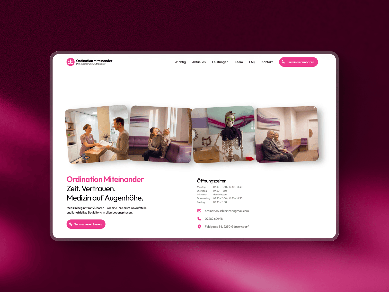
What stayed is a single-page site where the five things patients actually need – opening hours, contact, location, services, and a one-tap booking button – are visible without scrolling or searching. No clutter isn't a style preference here; it's a functional requirement. Every extra element is one more thing an 80-year-old has to parse before finding the phone number.

The pink came from artworks already hanging in the practice. My first draft ran softer, but the client wanted more saturation. They were right: it reads as warm and distinctive in a category that defaults to sterile blue and green. The photography was already there too, including a waiting-room skeleton wearing sunglasses and a scarf, which I kept in the hero carousel on purpose. It shows a real place with a bit of humour, not a stock-photo version of medicine.

The outcome: a site that does exactly what the practice needed, without any of the parts they didn't. The cut prescription feature isn't a failure – it's the version of the brief that shipped on time and stays maintainable.

Categories

Categories

UI/UX

UI/UX

Web

Web

Industry

Industry

Medical Services

Client

Client

Ordination Miteinander

When a GP practice in Lower Austria came to me, they didn't have a website at all. The brief was simple: build a first web presence that makes everything as easy as possible for patients who skew older and less comfortable with tech. "Easy" had a specific meaning here – no one wants to click three times to find out whether the practice is open today.

The original scope included a GDPR-compliant online prescription reordering flow. I spent real time on research and tests, but we ended up cutting it. The compliance overhead outweighed the benefit for a practice this size, and keeping it in would have pulled focus from the parts that actually matter day-to-day. Shipping the right thing matters more than shipping everything.

What stayed is a single-page site where the five things patients actually need – opening hours, contact, location, services, and a one-tap booking button – are visible without scrolling or searching. No clutter isn't a style preference here; it's a functional requirement. Every extra element is one more thing an 80-year-old has to parse before finding the phone number.

The pink came from artworks already hanging in the practice. My first draft ran softer, but the client wanted more saturation. They were right: it reads as warm and distinctive in a category that defaults to sterile blue and green. The photography was already there too, including a waiting-room skeleton wearing sunglasses and a scarf, which I kept in the hero carousel on purpose. It shows a real place with a bit of humour, not a stock-photo version of medicine.

The outcome: a site that does exactly what the practice needed, without any of the parts they didn't. The cut prescription feature isn't a failure – it's the version of the brief that shipped on time and stays maintainable.