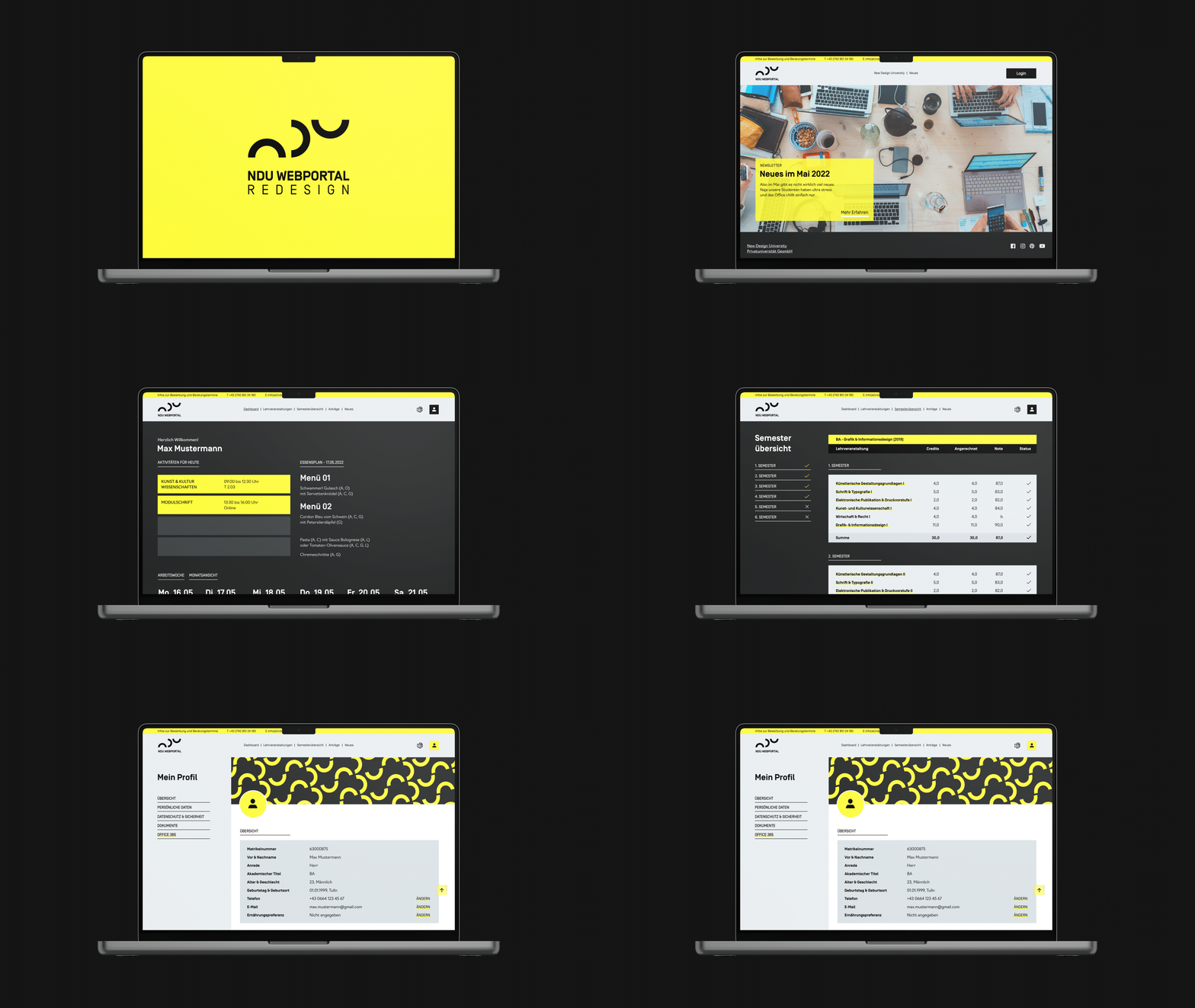
I undertook the challenge of redesigning the New Design University’s Student-Portal. This project aimed to improve the user experience and user interface for students, faculty, and staff, creating a more cohesive, accessible, and user-friendly platform. Through a thorough analysis and restructuring of the existing features, the goal was to build a streamlined Dashboard that houses all essential academic tools, making it easier for users to navigate and manage their academic activities in one place. Here’s how I approached this reimagination.

Objective and Approach
The primary goal was to rethink the layout and usability of the Student Interface: I envisioned a platform that simplifies the user journey, offering quick access to key tools and resources needed for an efficient academic experience. This redesign involved a detailed analysis of the current web portal, focusing on re-evaluating core features to better meet user needs. I approached the project in several key stages:
Project Scope

Feature Audit and Prioritization
I began with an audit of the portal’s features to identify the core functionalities that users rely on most. This allowed me to prioritize essential tools and eliminate redundant elements that could clutter the user experience. By focusing on academic and administrative needs, I streamlined the platform to make sure only the most relevant features were highlighted.

User-Centered Design
Using a user-centered approach, I conducted research and gathered feedback to understand user behaviors, pain points, and expectations. This data-driven design process informed every stage of the redesign, ensuring that the new interface would feel intuitive and accessible to users. My goal was to create a portal that adapts to user needs and simplifies their online interactions.

Streamlining Navigation
A major focus was on improving navigation. I restructured the navigation to ensure that users could access critical resources—like class schedules, academic records, and communication tools—with minimal clicks. Reducing unnecessary steps, adding shortcuts, and grouping similar functions under clear menu categories all contributed to a more efficient and enjoyable user experience.

Visual Consistency and Branding
To maintain a professional and engaging look, I applied cohesive design elements that align with the university’s branding. Using consistent colors, typography, and a clear visual hierarchy, I crafted a clean and modern interface that reflects the university's identity. The goal was to create a visually pleasing portal that not only meets functional needs but also enhances the overall brand experience.

Outcome
The final result is a consolidated, user-friendly platform where students, faculty, and staff can access everything they need for a smooth academic journey. By housing all essential resources in one accessible location, the redesigned portal provides an organized and efficient experience, supporting users throughout their academic lifecycle.


